Case study 02

Green Goddess

From soil to soul, we rise.

Beyond the Logo 2025 · 1st place · Designer · Strategic Planning, Identity, Website

Green Goddess

01 · The brief

A competition. A real client. One week.

Beyond the Logo 2025. 14 teams. 45+ students. One winner.

Each team was assigned a real client and asked to deliver strategic planning, a brand identity, and a working website. My team of three had it mapped out. Strategic planner, graphic designer, web designer. I was on web.

02 · The twist

Then both of my teammates left. One week before the deadline.

No warning. No handoff. No work done.

So I took over. Strategy. Identity. Website. Everything the three of us were supposed to make, I made alone, in seven days.

I didn't know if I would finish. I just kept going.

03 · The client

Green Goddess.

A community-rooted social justice organization empowering BIPOC girls and gender-expansive individuals through a six-step leadership journey: outdoor exploration, holistic wellness, environmental justice, career readiness, mentorship, and community partnerships.

The mission was about empowerment. The design had to feel like it.

04 · The build

Three moves, one cohesive system.

01

Strategic planning

Partnerships with schools and grassroots organizations. Emotive storytelling with vibrant, earthy visuals. Social media strategies and community workshops. The plan had to hold up before a single pixel was drawn.
Identity
02

Identity

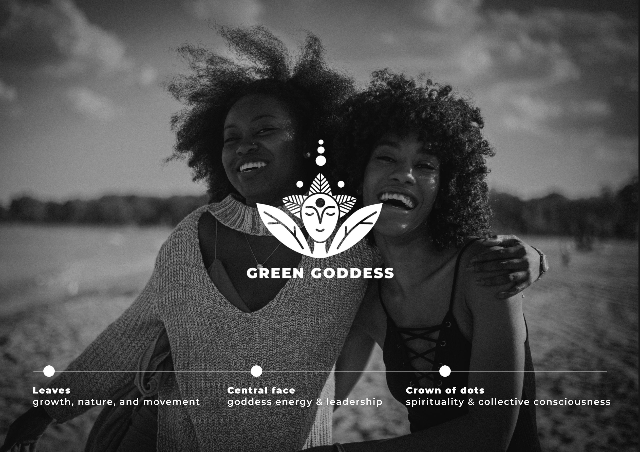
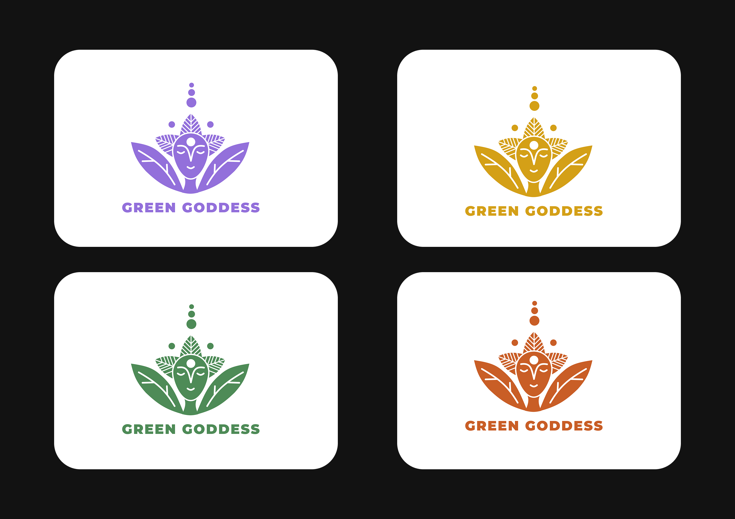
A bold mark reflecting cultural roots. Leaves for growth and movement. A central face for goddess energy and leadership. A crown of dots for spirituality and collective consciousness. Four colorways, one identity.

03

Pattern + palette

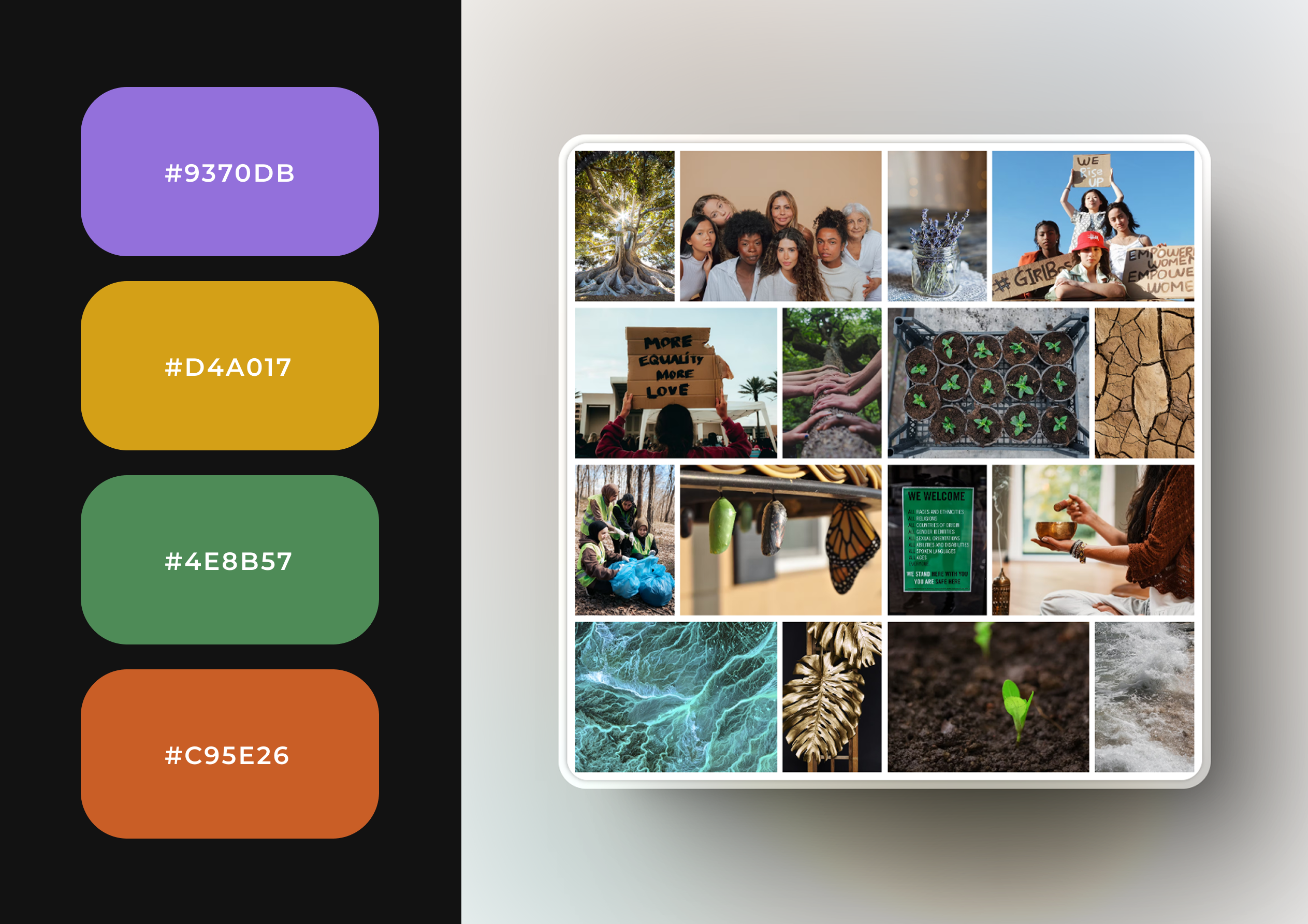
A custom pattern derived from the logo, applied across every touchpoint. A four-color palette rooted in earth and culture: deep green, gold, orange, and violet. The system reads as one thing because it comes from one place.

Pattern
Palette
04

Print + merch

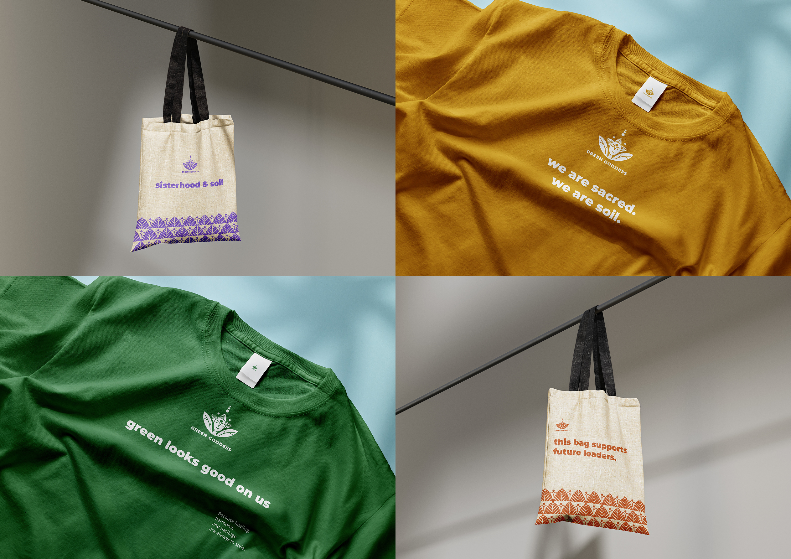
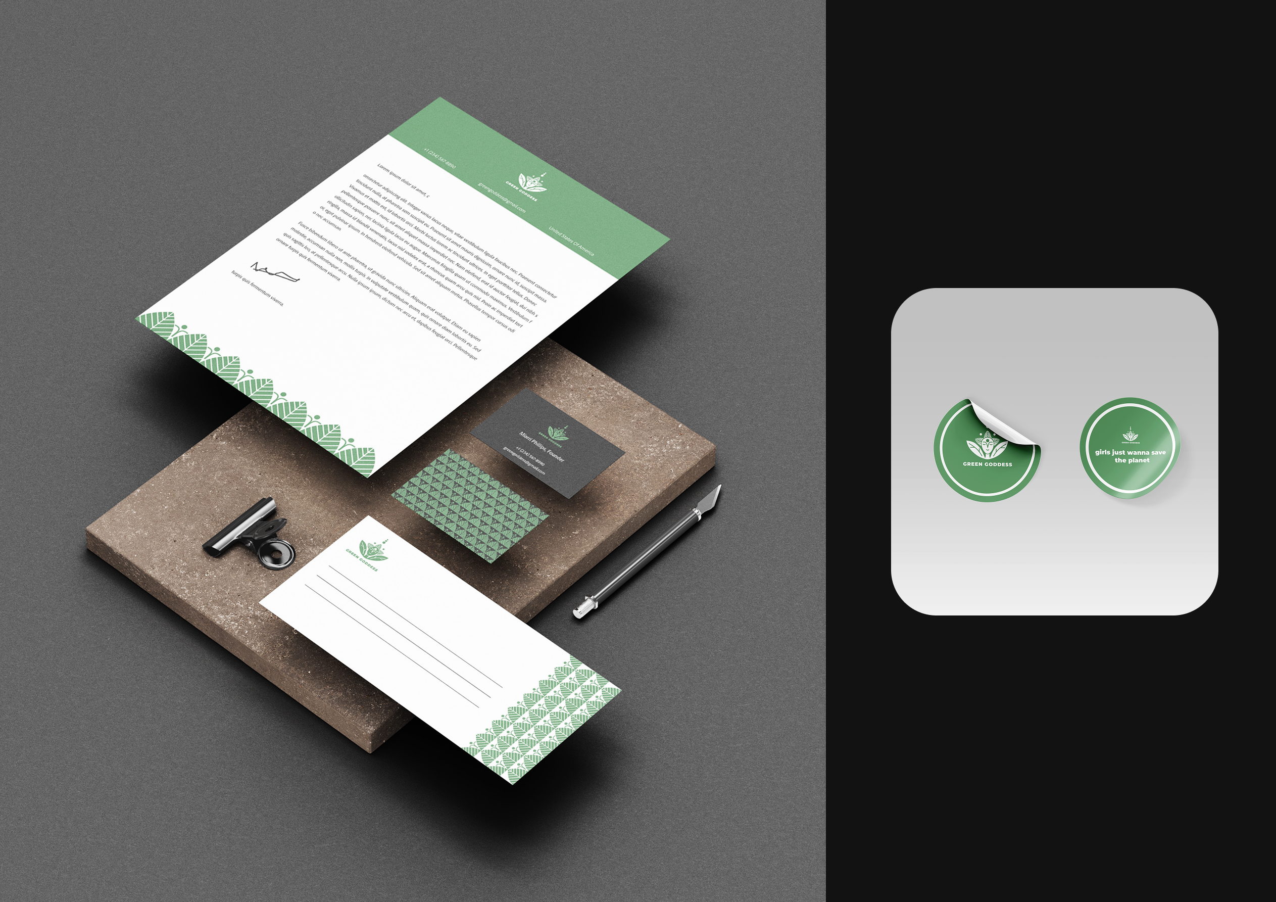
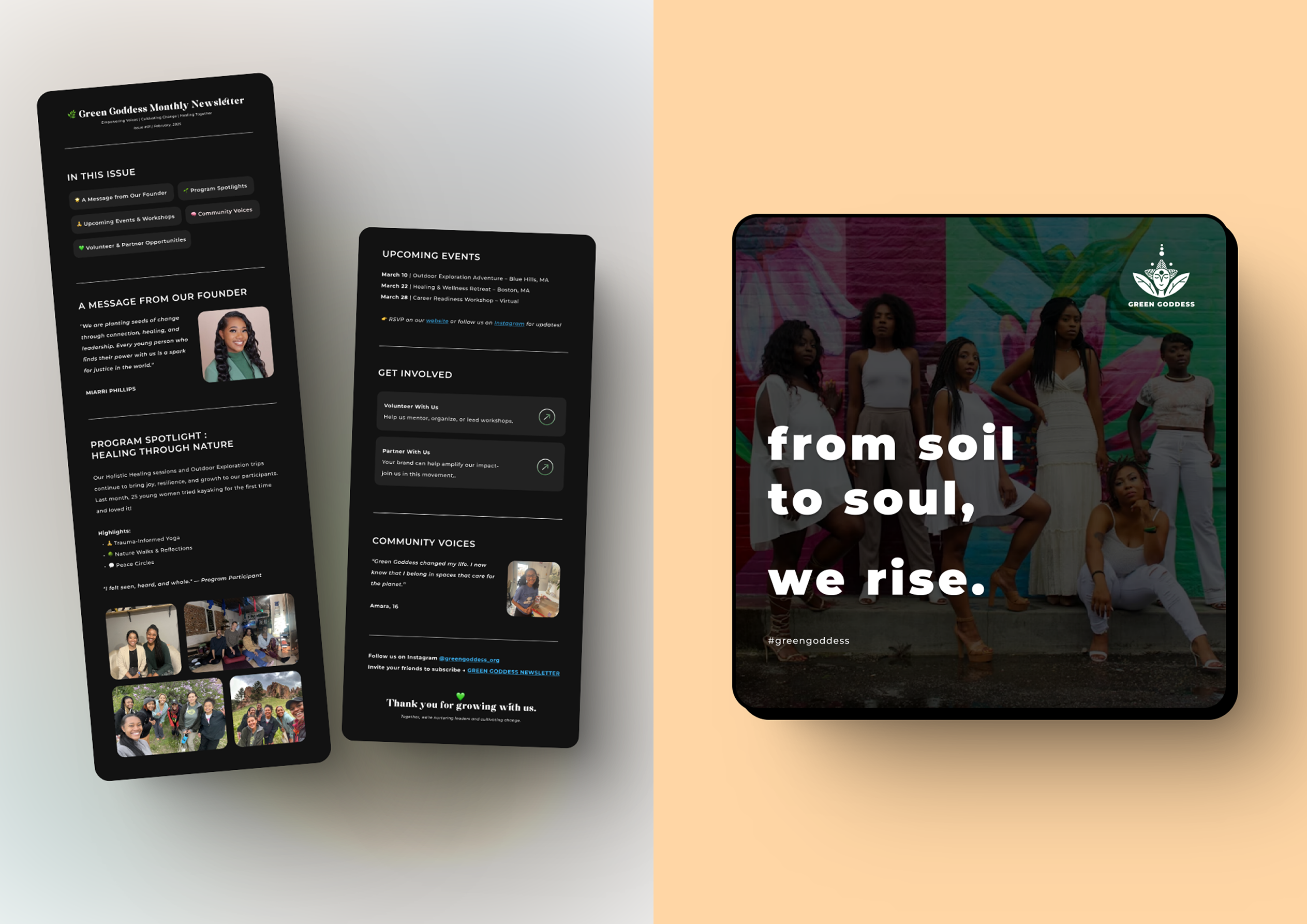
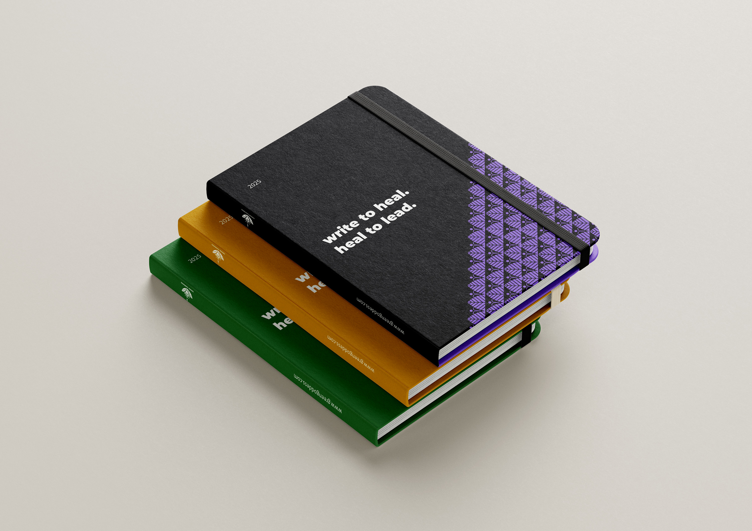
Eco-conscious t-shirts, journals, tote bags, stickers, letterhead, business cards, and a branded newsletter. Each piece uses the same pattern, palette, and voice, so the identity travels everywhere it goes.

Merch
Letterhead
Newsletter
05

Website

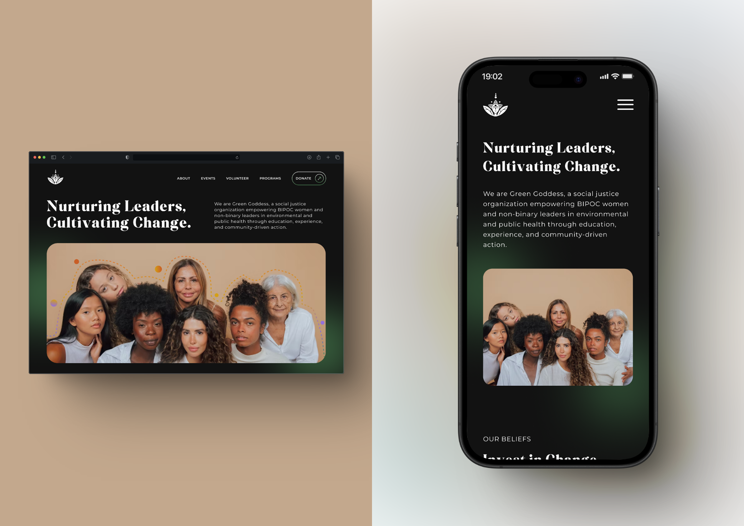
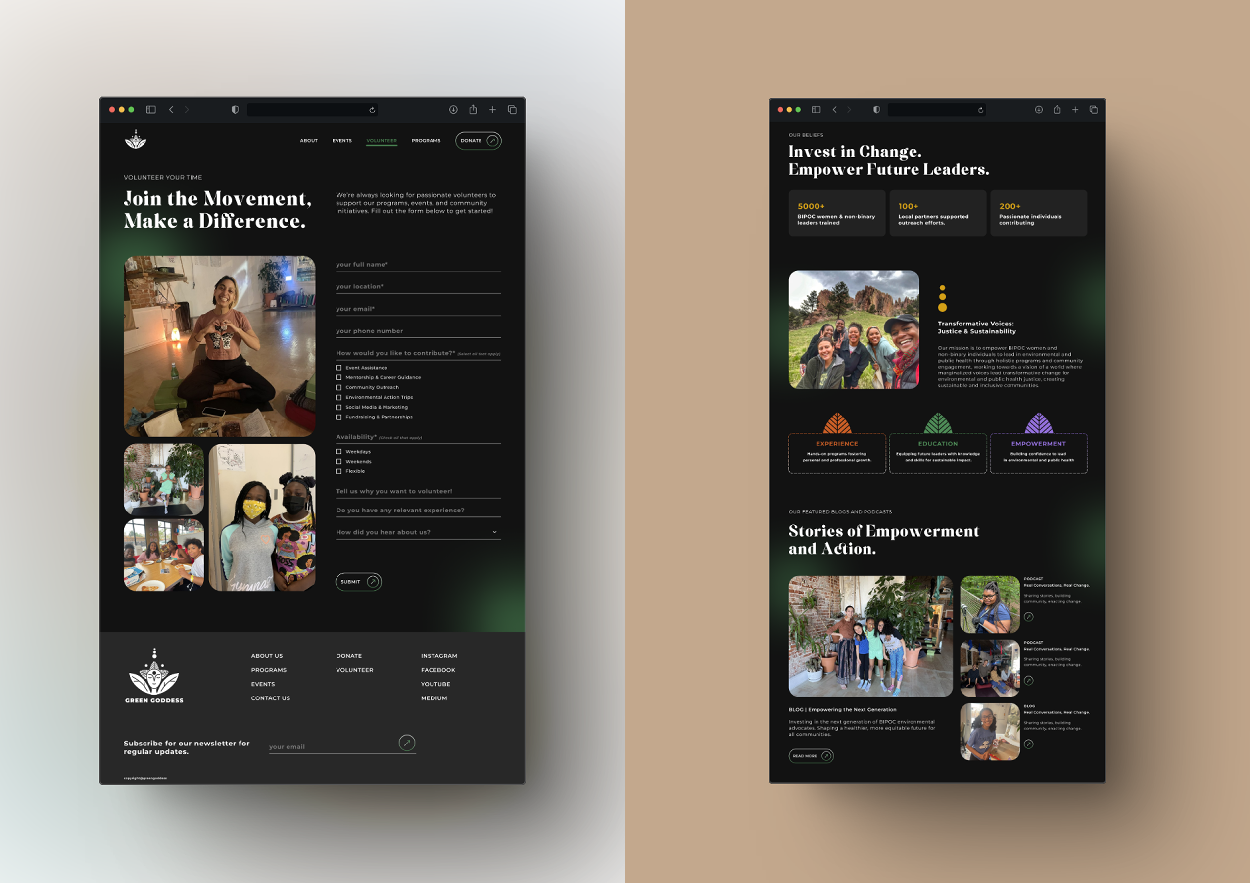
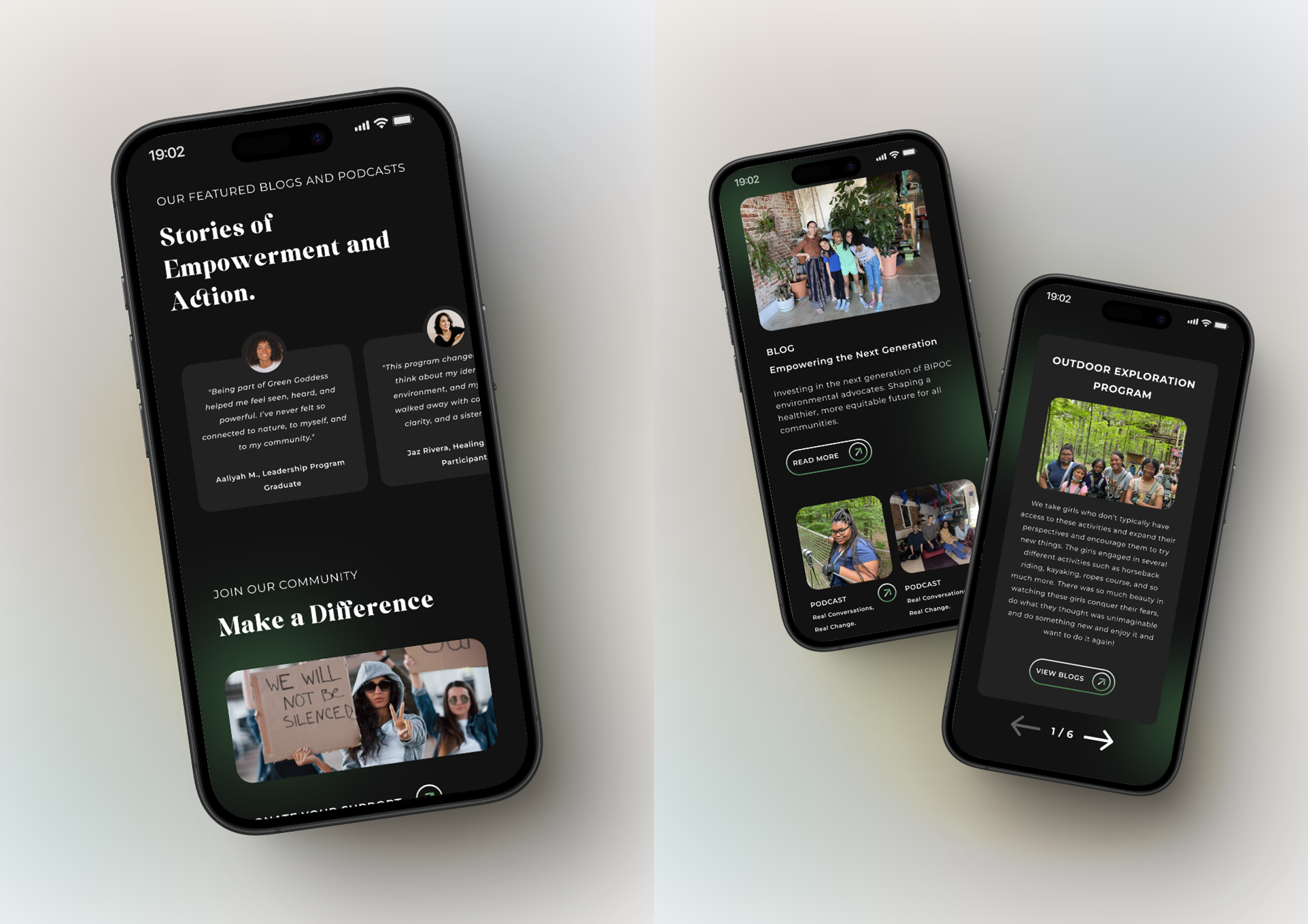
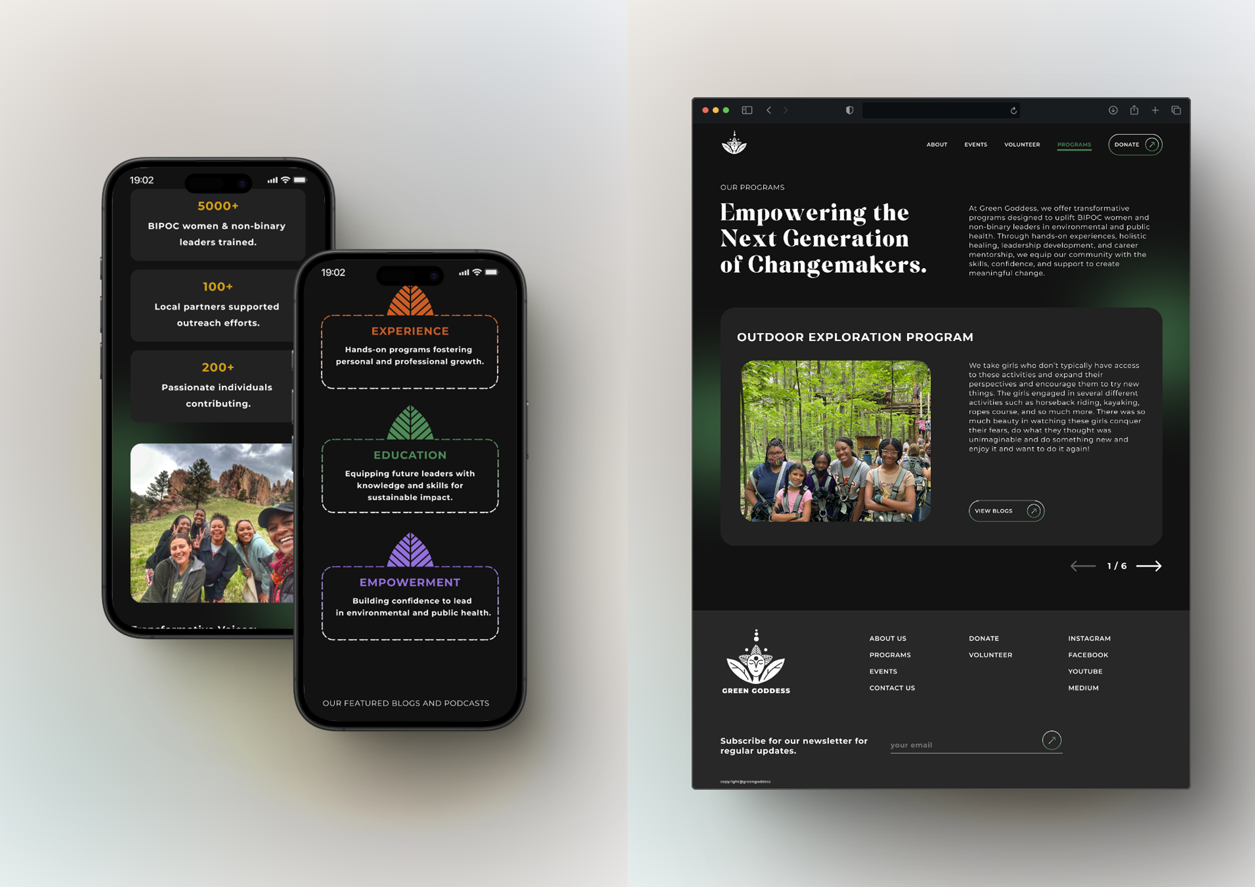
A dark-mode interface with minimal but strong color branding. Clear navigation, stronger CTAs, testimonials, and a revamped About page. Built to be accessible and engaging for both youth and partners.

Website 01
Website 02
Website 03
Website 04

05 · The craft

Everything traces back to the logo. That's the point.

Bold. Inspiring. Inclusive. Rooted in authenticity.

The visual language is earthy but strong. The palette is anchored by deep green, warmed by gold and orange, and punctuated with violet. A system is cohesive because it comes from one source, not because it looks busy.

06 · The numbers

0+

BIPOC women and non-binary leaders trained

0+

local partners supported

0+

passionate individuals contributing

Green Goddess

The work continues.